Developing a UI component style guide
- November 2016
- UX, Visual/UI Design, Interaction Design
- Personal Project
The Challenge
The clients I have worked with over the years typically had established brand language. Barring minor tweaks, I had not had the chance to develop a style guide from scratch. I finally had the opportunity at my job at ObjectRocket, but that style guide was not implemented because the company was acquired and product priorities changed. I created another to demonstrate the process I followed on the live project.
Defining the Requirements
The proposed solution needed to fulfil the following criteria:
- 1. The guide was being built for an existing web application with some functionality on mobile
- 2. Existing usability issues or interaction limitations in the UI components needed to be fixed
- 3. Existing UI pattern inconsistencies needed to be resolved
- 4. The UI components needed to function within a fluid framework
- 5. The developers would need interaction and styling specs for the components
Developing a color palette
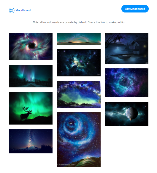
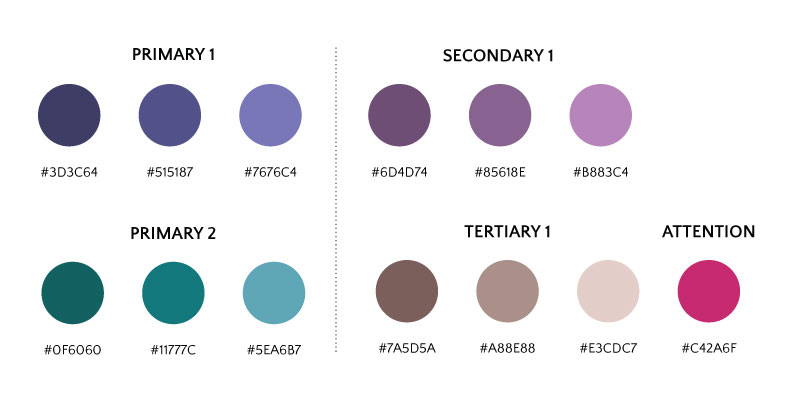
I've always been fascinated by space nebula and the auroro borealis phenomenon and can look at images of those for hours. For this sample project, I decided to base my color palette on those, and built a mood board of images. For the actual project, I followed the color palette on the company's style guide to bridge the lack of visual connection between that and the app's GUI (It's a long story).
I then uploaded the images to a color palette generator, and went through a process of elimination of the swatches that resulted from that, until I had a combination I felt like I could proceed to experiment with.
I broke up the swatches into primary, secondary, tertiary and a call-attention-to color, and followed that with identifying varying saturations for each that could be useful for subtle interactions.
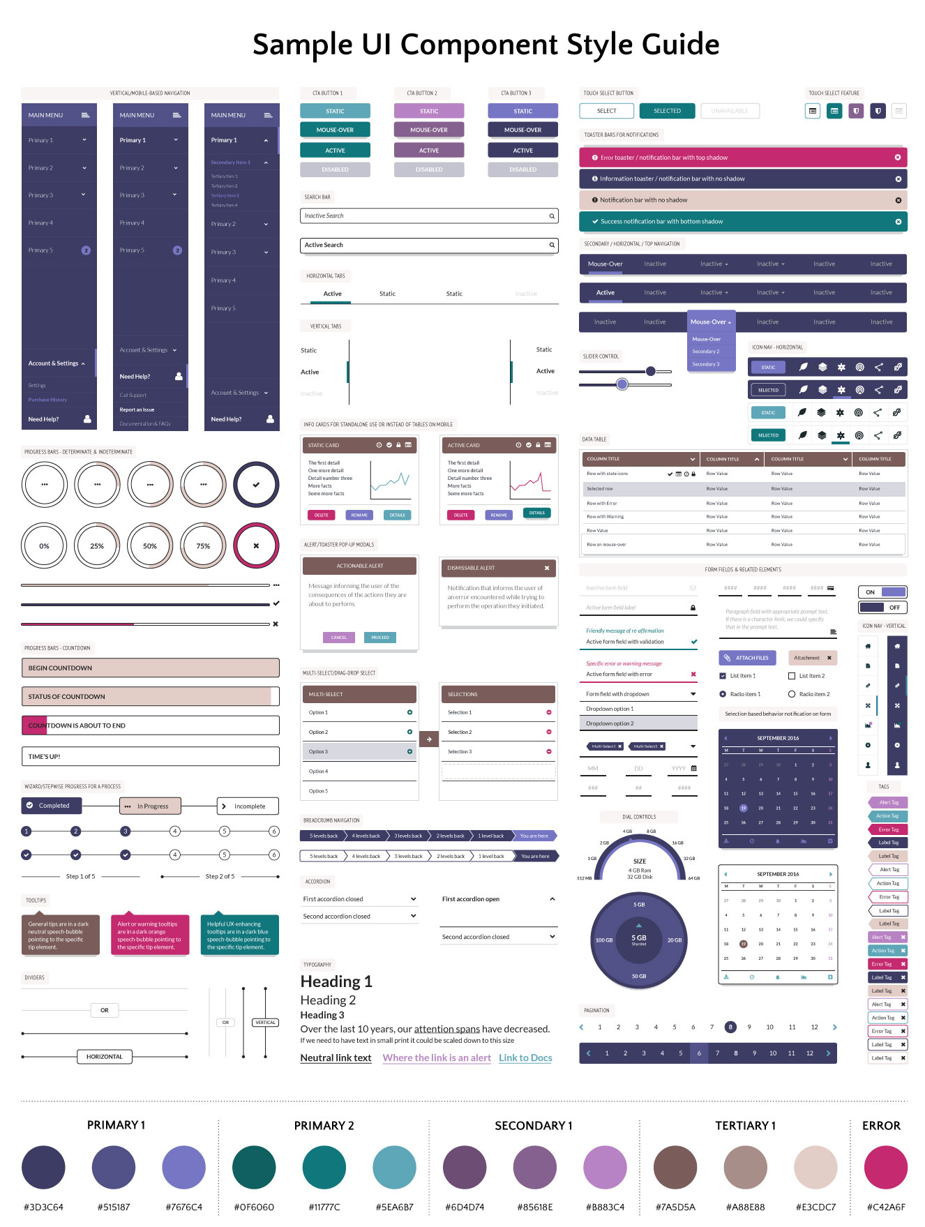
Documenting UI Components
In order to understand all the components that would need to be defined in the style guide, I went through all of the screens in the application, and distilled a list of existing components. I then identified a couple of variations (Eg. Slider vs. Dial Control) for some of the components that could be useful down the road.
Research & Inspiration
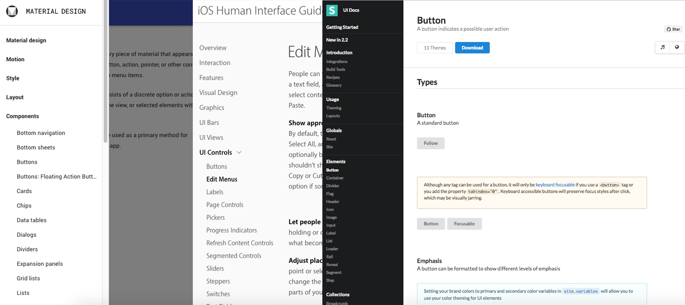
Since it was a first time for me with this exercise, I needed to really examine what was out there and how people were tackling putting together a component guide. I am aware that sometimes looking at other similar work could impact my approach, but in this case, since I was designing for an existing framework, I needed to understand industry standards and the extent to which I needed to stay within the lines.
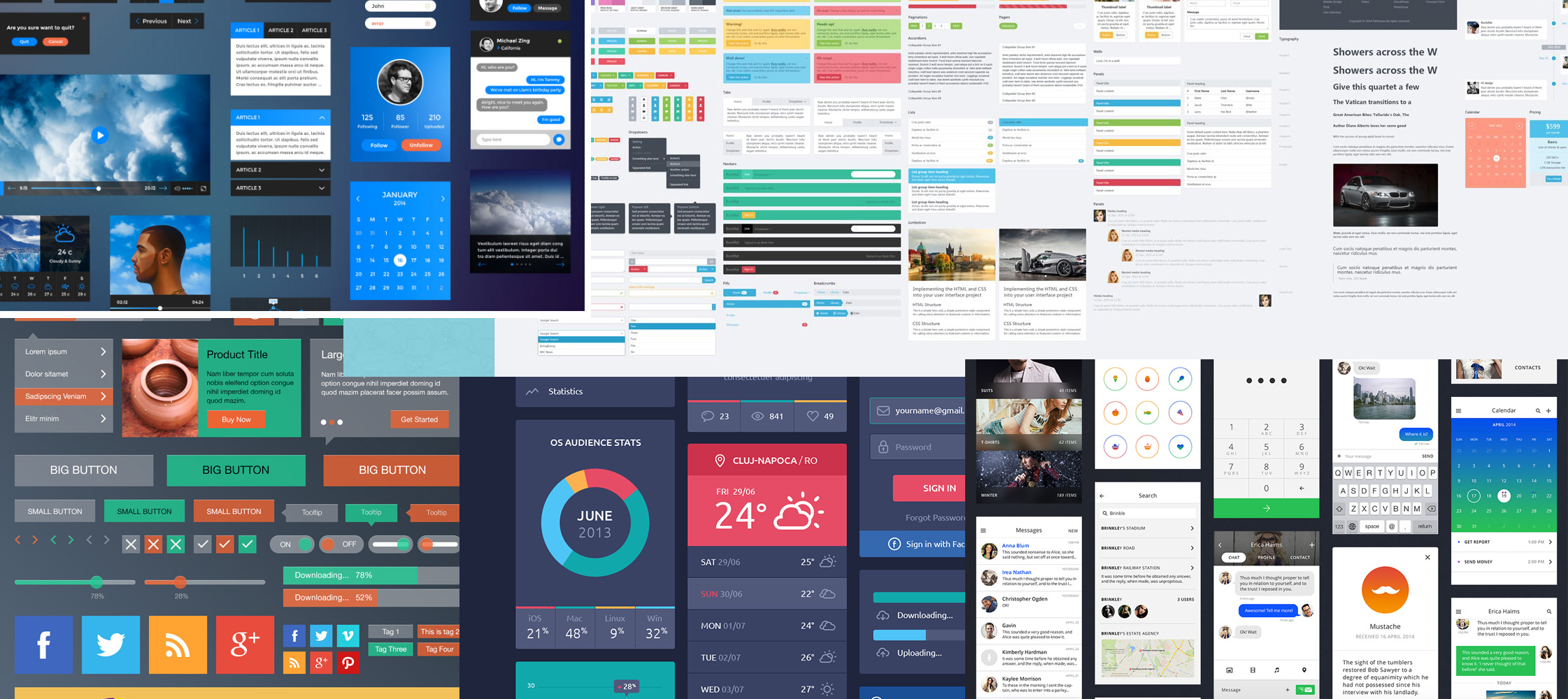
I looked at material design, iOS, and a number of other open source UI component projects and started to take notes on the elements and interactions I liked, and felt could benefit my own project. I also looked at an extensive list of UI component kits and found tons of inspiration.
After all of this research, I felt like I could finally start to tackle what had seemed a bit of a mountain at the beginning. I decided to go with a keep-it-simple approach, and since color is an area I feel comfortable in, perhaps rely on that to help define patterns of use. But using color as a usability guide is tricky and I also had to be careful with this approach
The Components
Over a period of about a month, I arrived at a catalog of all the components, and their states, interactions and style specs for max and min-width media queries. There were many, many revisions, changes, feedback cycles from the marketing team, and the developers on what was feasible and what wasn't, and it all resulted in this version, the 8th for the record.
Behavior Patterns
I broadly classified the behavior patters as affirmation, disgreement, neutral and failure, and assigned colors to those and tried to keep those patterns consistent so the user could use colors to cue decision making over time.
Interaction Patterns
As for interaction patterns, I kept them fairly subtle and simple, and it is only when I can actually see them in a functional form that I can guage if the interaction has the desired effect. I am in the process of finding a tool that will help me effectively prototype the component interaction in a fairly short time-frame.
Room for Improvement
Another requirement I did not consider initially that I would like to factor in now is accessibility. The color palette needs better contrast to help those not sensitive to subtle changes in color, while not deviating from the basic palette too much for reasons of experience consistency. I need to research this some more, and perhaps the answer is an option to toggle between the regular interface and an accessibility-enabled version?
The style guide also included basic typography specs as a first step, but I had to tweak these based on the media query limits.
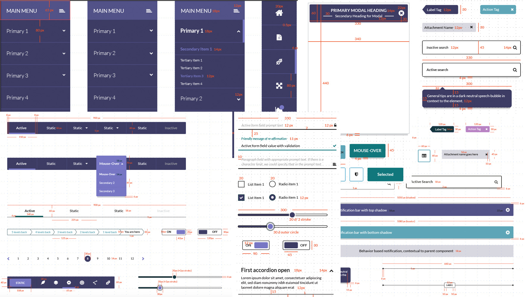
Defining Specs
After a pretty extended meeting with the development team, and what would be most helpful for them while building these components, we decided that I would provide max and min width specifications.
Reference Data
I asked for data from our analytics reports to determine what the most common screens widths/resolutions/devices were that our customers were accessing the app on, rather than basing the specs on just what was acceptable generally.
I laid out the specs in a visual format first, since I felt that might be easier to follow when building the components. A picture speaks a thousand words, yes?
Being fairly comfortable with CSS, I also went ahead and defined styles for all of the components in a comprehensive Google doc. in an effort to maybe reduce some burden on the development team. It turned out that they really appreciated this, and only had to make minor changes.
Testing
Having limited resources to test with users and no access to customers, I had to rely on testing with people who were unfamiliar with the interface, but had domain knowledge since this persona approximated the actual customer. Testing resulted in positive feedback, and the need for changes on some components and interactions.
As a result of this project, I feel like I have come a long way in understanding what is involved in developing a component style guide, where I could have been more efficient or better-informed, and also what development challenges may arise in a project of this nature.
Back to Portfolio