Enterprise App Redesign
- January 2015 - March 2015
- UX Design, Wireframing, Interactive Design, Visual Design
- Vigyanlabs Innovations Pvt. Ltd.
- Interactive Prototype
The Project
The company had a dedicated enterprise offering of their power-saver application for a single customer, and based on the redesign of the mobile app that I had been involved with, they wanted to update the visual and interactive design of their enterprise app.
Research & Observation
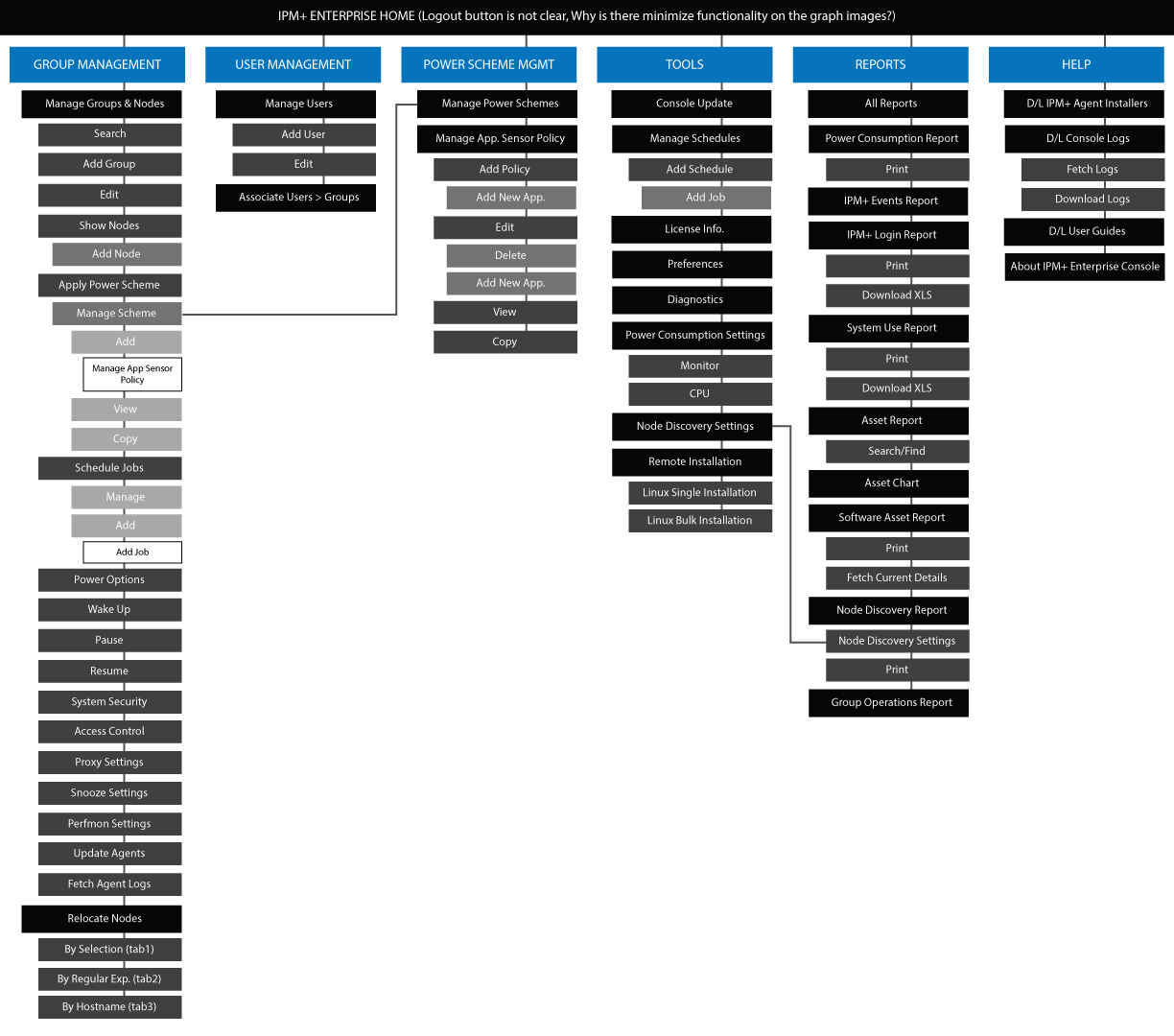
I felt that in order for me to do a good job with the redesign, I needed to use the application first. The application was built only for Windows, and I didn't have a compatible machine. So, I requested the company to give me a spare laptop with the application installed on it, and access to use it. Due process followed, but eventually, I had a laptop and spent a couple of weeks using the application and creating a comprehensive sitemap.
There were a lot of open paths where the user would hit a dead-end, disconnected functionality on certain screens as well as a number of redundant pages connected in loops. The sitemap was a bit of a mess, and the first task I took on was to present this issue to the team, and get their approval to sort through it and suggest a new sitemap.
I wish I had done a better job documenting my process and saving the artefacts (pencil sketches, flowcharts, documents etc.) for this project, but the only thing I can seem to find on my hard drive is the finished sitemap that I used for the redesign.
Wireframing
As with the mobile project, the timeline was quite aggressive, so I proceeded to wireframe new template layouts for the screens, based on the sitemap, content on the screens and the new navigation paths - a few rounds of feedback, and many revisions later, the team settled on a version that they wanted me to proceed with for the high-definition mockups.
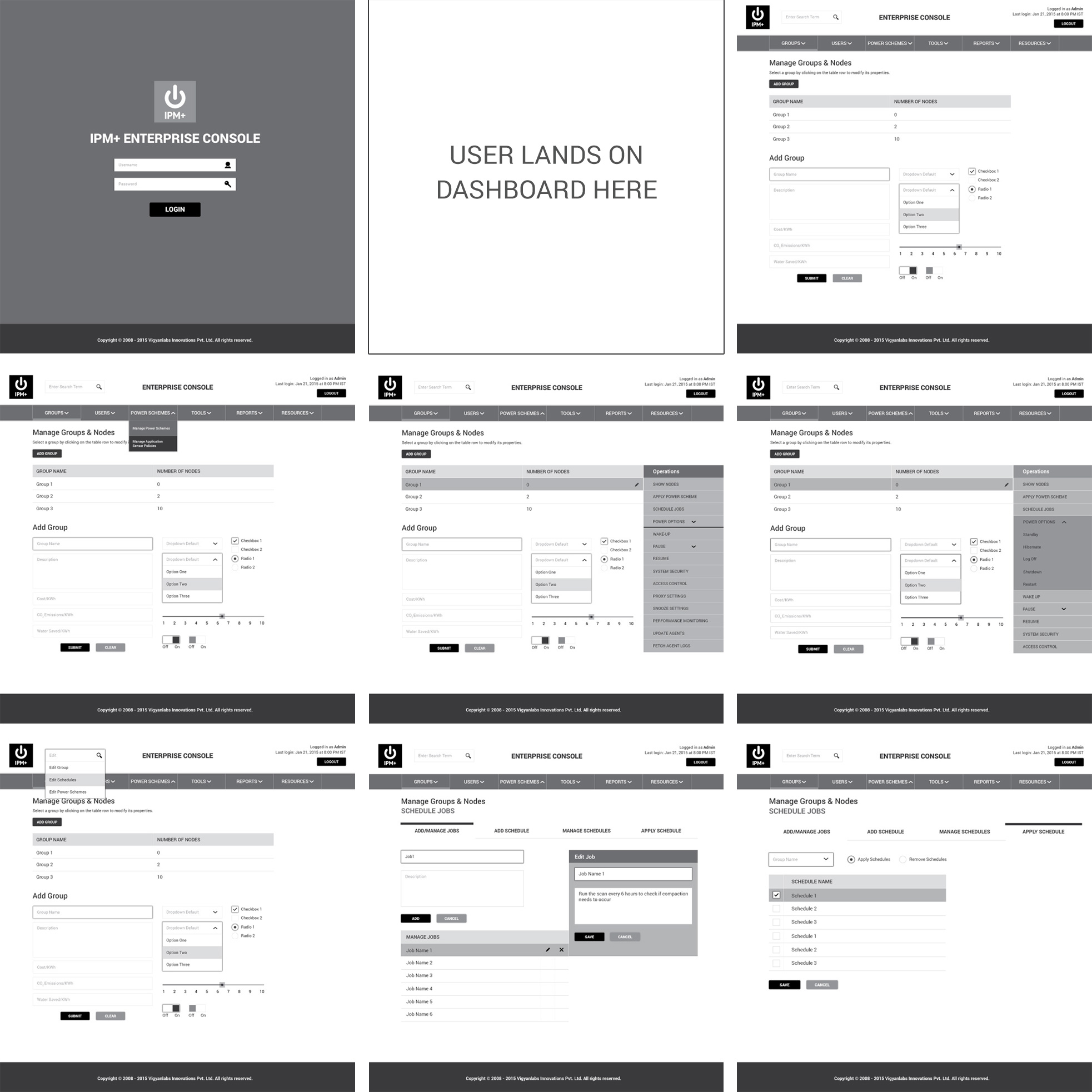
Colors & Typography
Since we already had established styling on the mobile app, I drew from that style guide, and made tweaks and additions as necessary for this context.
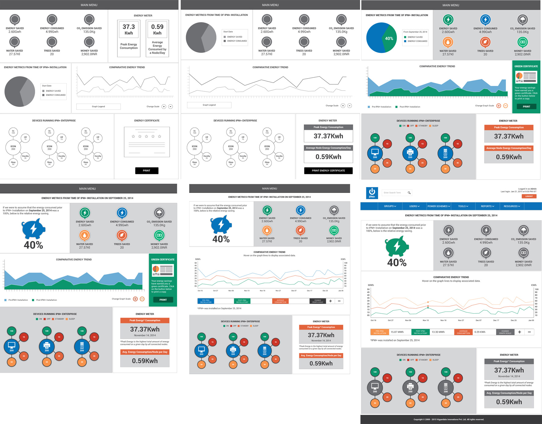
Pivot: A New Dashboard
Once the wireframe templates had the team's approval, I began working on translating those templates to high-definition mockups.
At this point I was tasked with adding a dashboard layout to the application, and that spun-off into its own mini-project. I talked to the team about what they would like the dashboard to show, what would be most valuable information for their client to gain in a snapshot, and created a few versions of the dashboard screen layout for review. Once the team had decided on the wireframe they felt most comfortable with, I added it to the list of wireframes I was building the high-definition mockups for.
High Definition Mockups
I had made the wireframes pretty detailed since I was trying to get the mockups finished in a short amount of time. Once I completed the mockups, there were a couple of feedback cycles, improvements to interaction consistency, simplifying page layout by nesting functionality within tertiary menus etc.
The development team then took over, and I never really got a chance to see the finished product since my contract with the company ended before they had completed the development on the redesign.
Interactive Prototype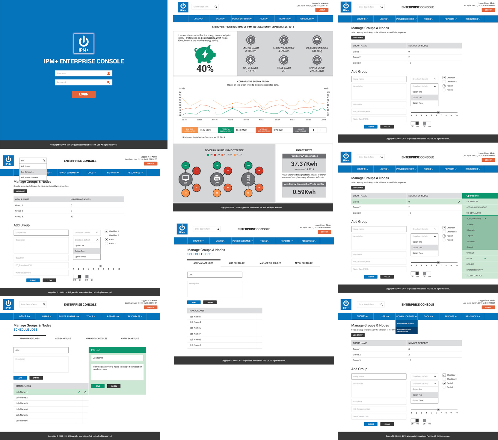
Back to Portfolio